Our new identity is inspired by our community and built for our future.
It all starts here. This guide is your go-to resource for understanding and applying our design and communications assets, helping you be a good steward of the PS 295 Brooklyn brand.
Over the past thirty years, Public School 295 Brooklyn has served a richly diverse family community representing South Slope Brooklyn and beyond. Together we celebrate our name “The Studio School of Arts and Culture,” weather challenges with determination, and empower our students, teachers, staff, and families with hope and joy.
As we look ahead, our small but mighty school prepares for a new chapter that is still yet to be written.
We are 295. Come dream with us.
Our look may have changed, but our purpose hasn’t. At PS 295, we believe in a constructivist approach to education. Our mission is to nurture proactive, joyful, and courageous learners, every single day. Since it’s introduction in 2024, the brand identity has become so much more than a logo. It is a celebration of who we are.
-
These brand values are at the cornerstone of the new communications strategy:
We are small but mighty. The student-to-teacher ratio is part of our strength, allowing every child to have a personal, powerful, and well-supported education experience.
Everyone is known and loved. We foster a focus on kindness, kindness, responsibility, equity, and inclusion with a can-do attitude that we can accomplish more together.
-
This is a unique moment in our school’s history, marking three decades nurturing joyful and courageous learners and serving both the South Slope and Greenwood Heights neighborhoods.
Following the disruptive years of pandemic, leadership changes, and citywide student population declines, the introduction of a new brand strategy in 2024 was a unique opportunity to present a strong, united, and growth-oriented vision for our school.
It’s time to step forward.
The funding for these brand updates had zero budget impact on PS 295. The Family Teacher Association’s 2023-24 budget surpluss covered the initial costs of new printed materials and digital upgrades. The complete set of professional designs are a pro-bono project of a PS 295 parent, Armistead Booker.
-
Prior to adoption, these brand guidelines were proposed to all school leadership, teachers, staff, and Family Teacher Association to collect feedback and garner support for these ideas.
All community members are invited to continue being involved in the ongoing process to strengthen our school and communicate our story to families, neighbors, district, and the city.
Beyond graphic design and content decisions, the big picture idea for this branding is that the community of PS 295 Brooklyn is ready to grow into the future.


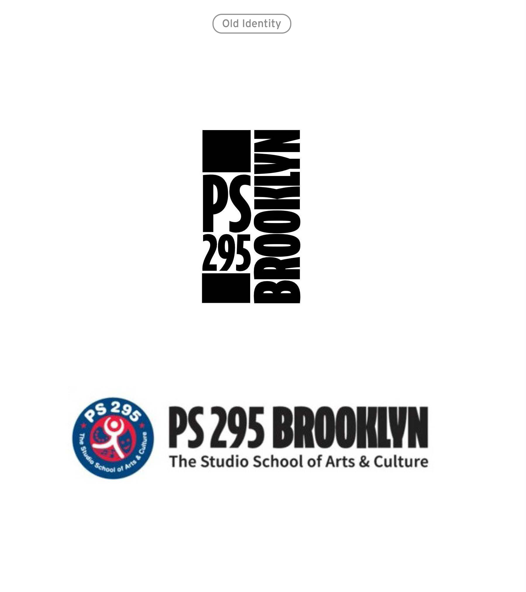
Logo
Introducing our Identity
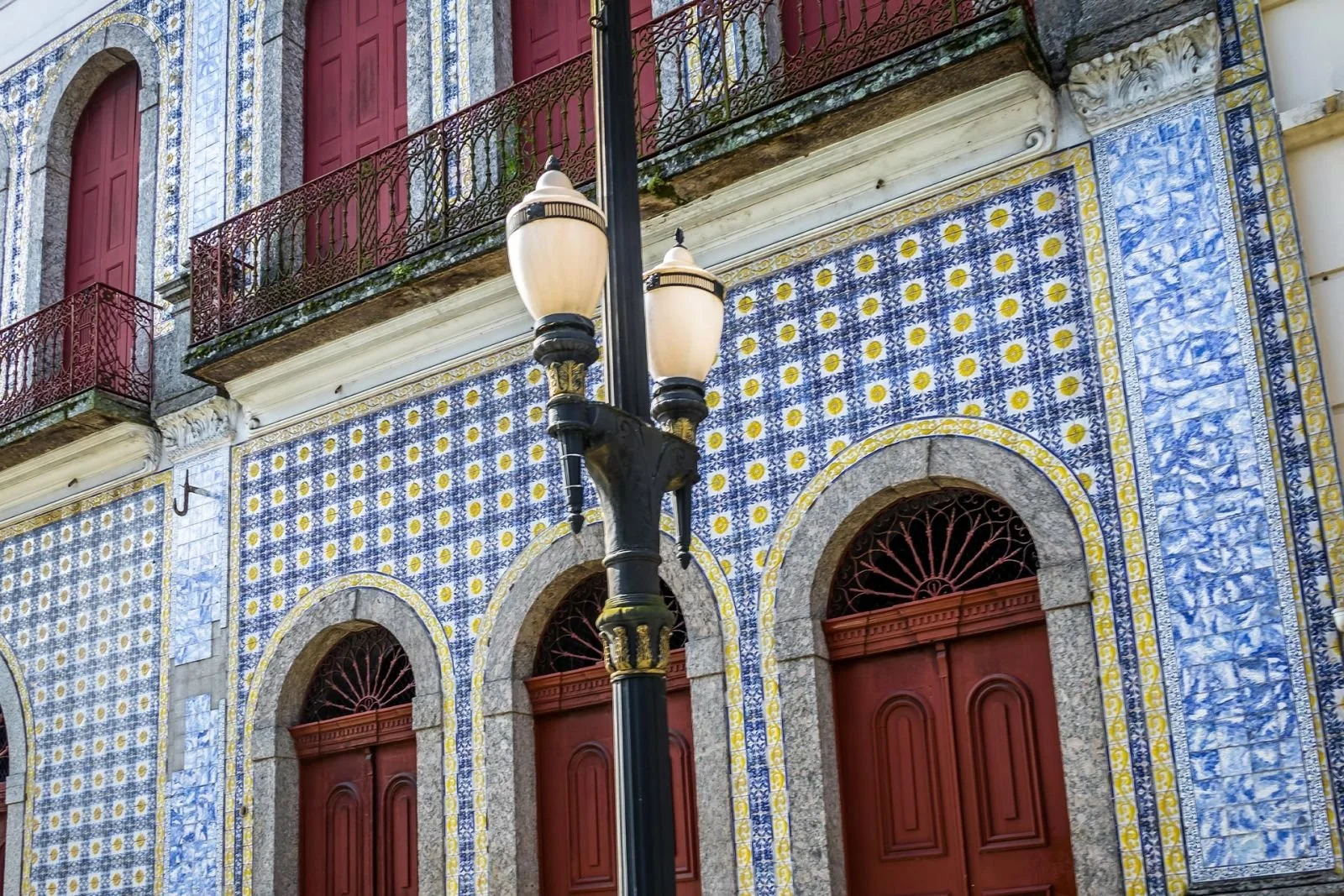
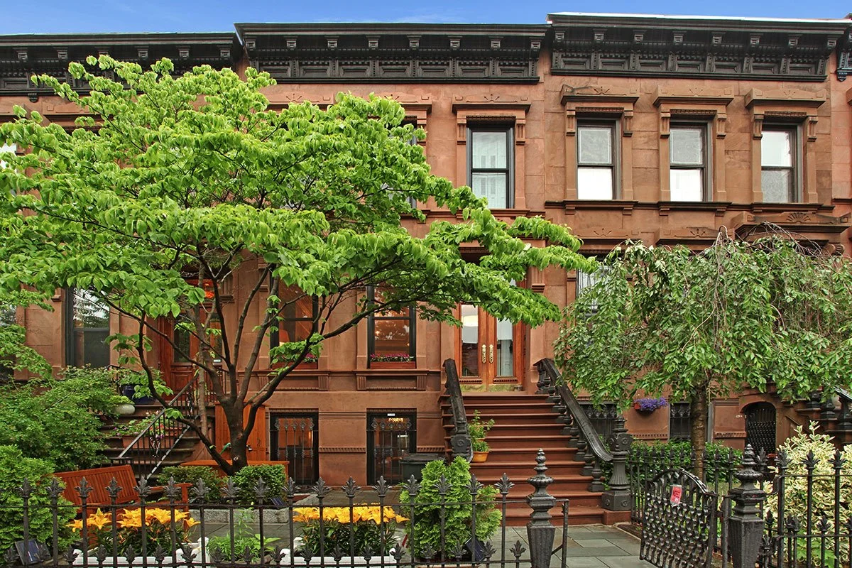
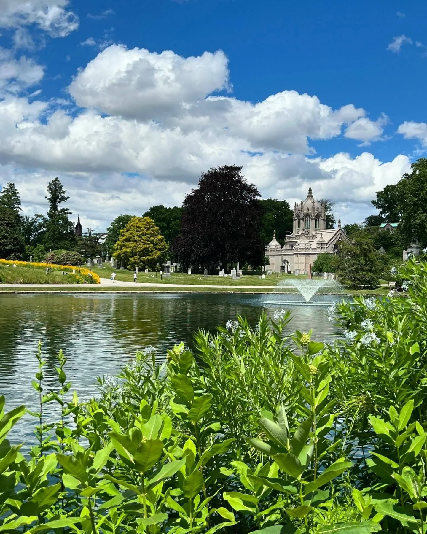
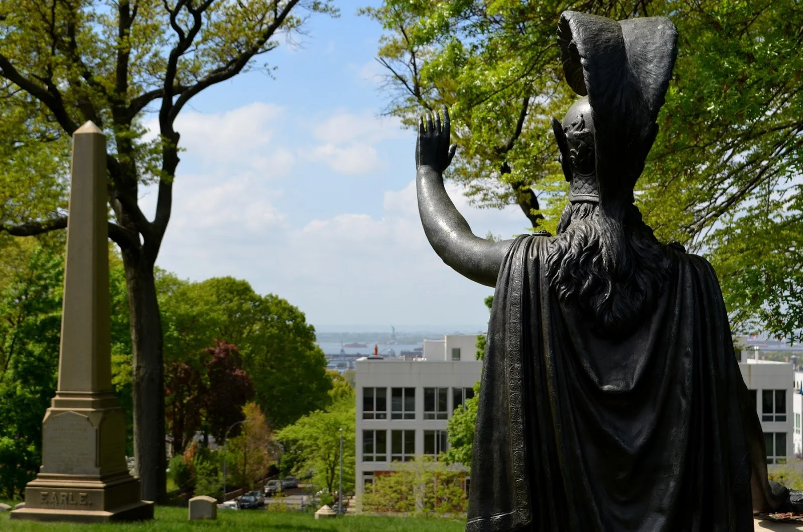
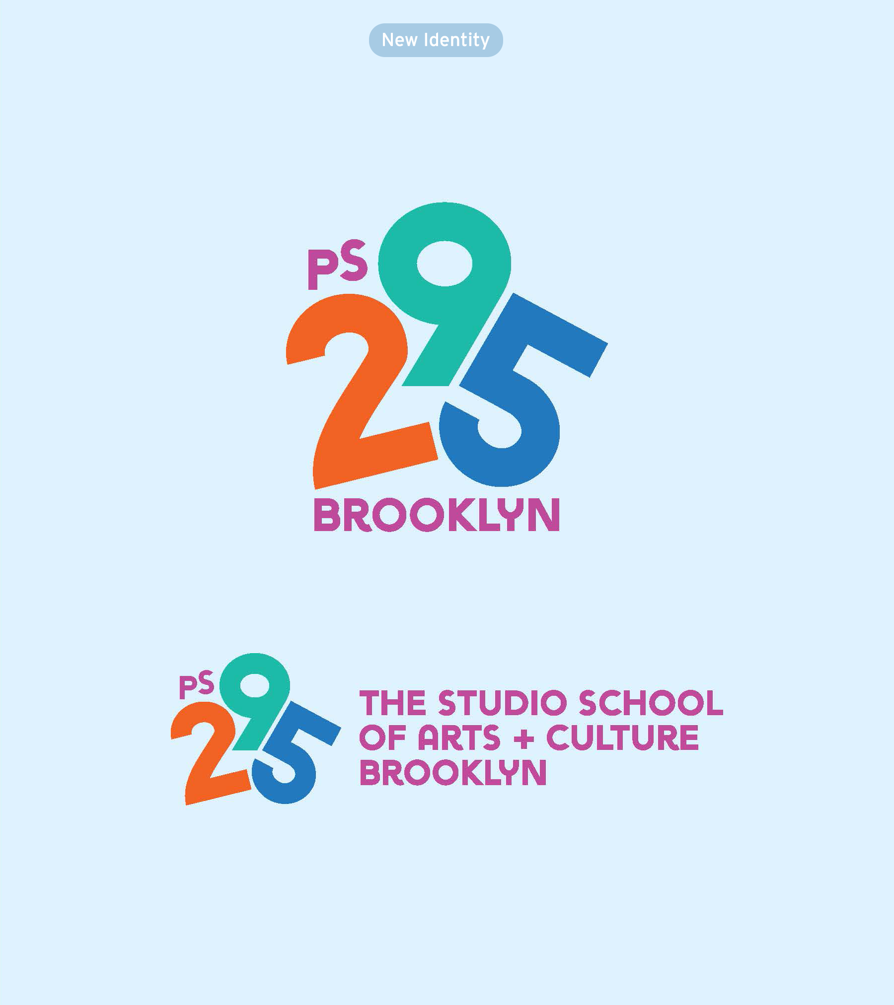
Our new logo brings together three visual elements of our dynamic neighborhood: Brownstone Brooklyn, Green-Wood Cemetery, and the NYC Waterfront.
It communicates the importance of play in our school: using a lively font, cheerful colors, and a layout that resembles a child jumping or group of kids together.
The logo is easy to read at any size, using a flexible layout that aids in translation. It also shifts focus of past logos from specific arts programming to a more abstract concept of expression, culture, and diversity.
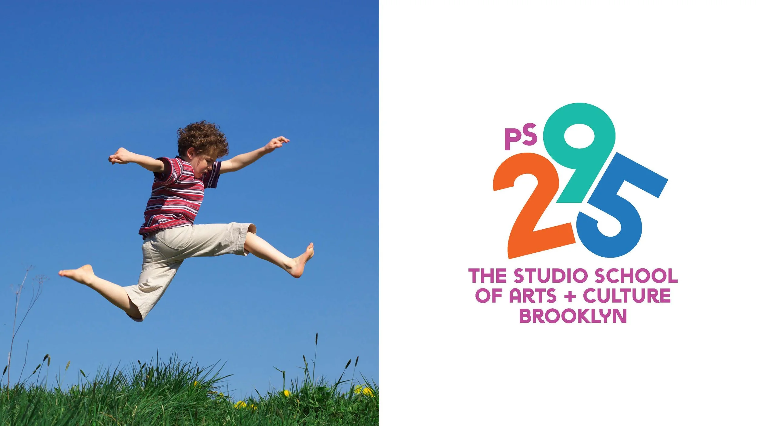
Jump for joy — logo inspiration
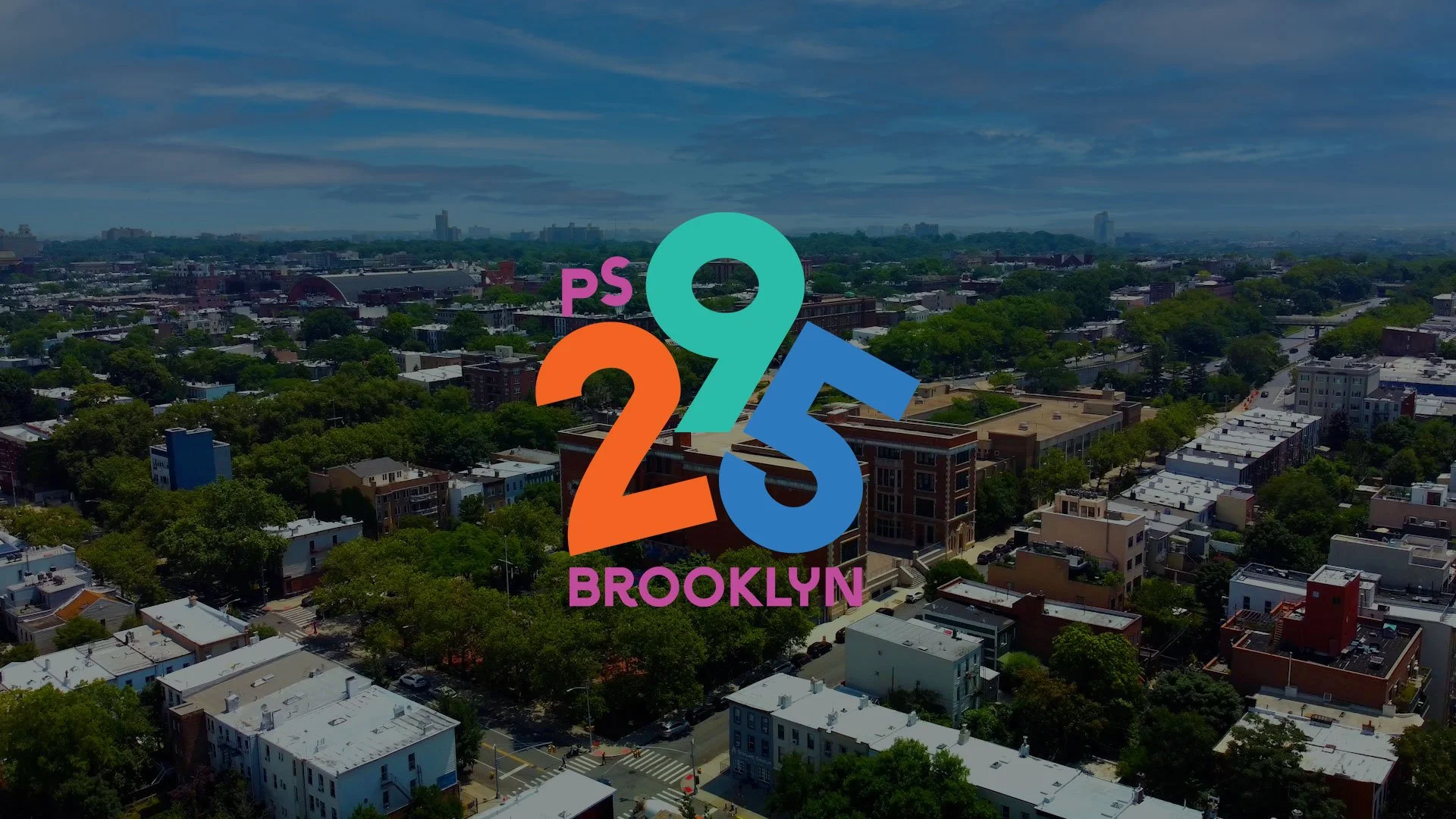
Full color logo overlay on an image
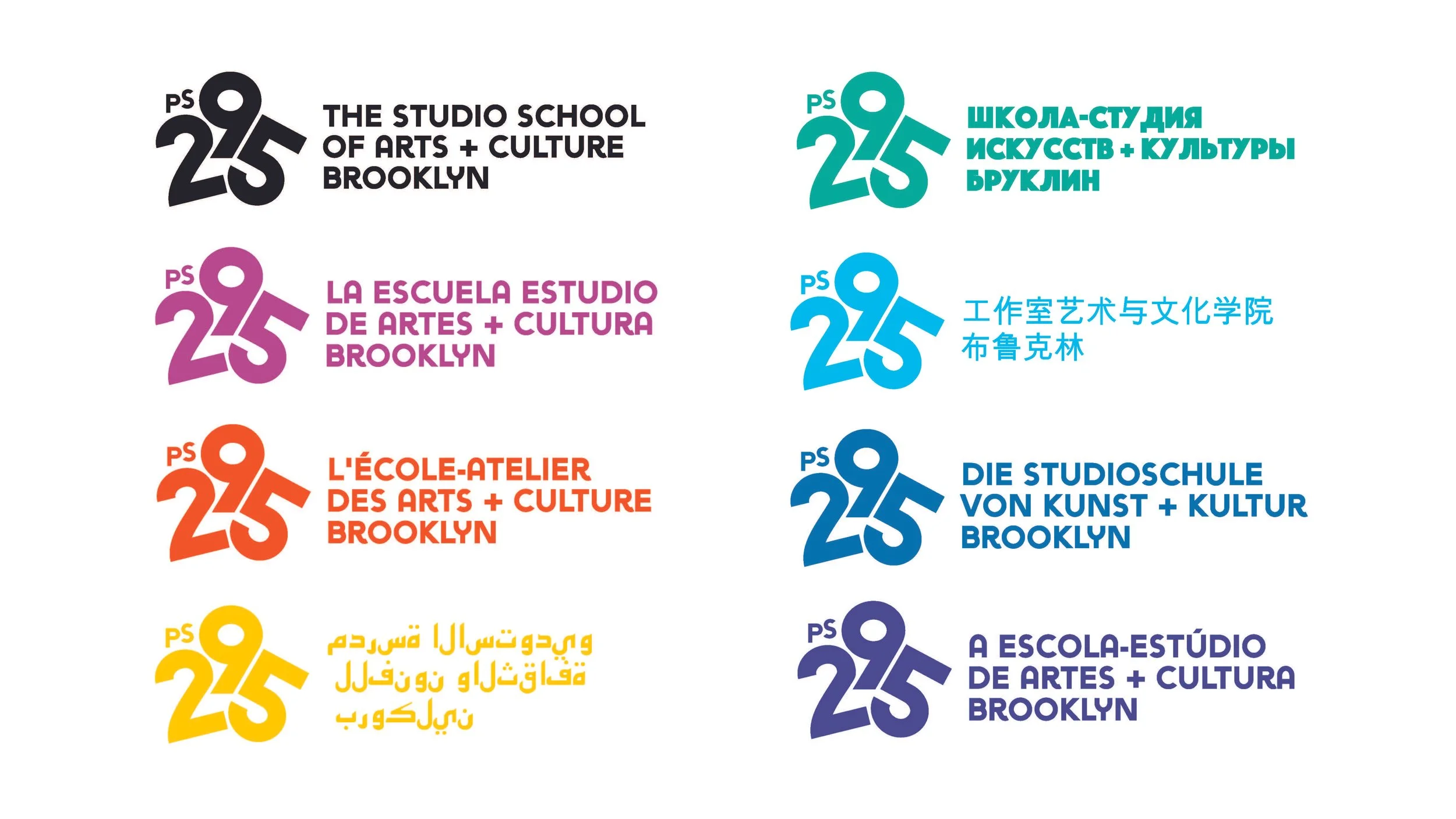
Multi-lingual formats in brand colors
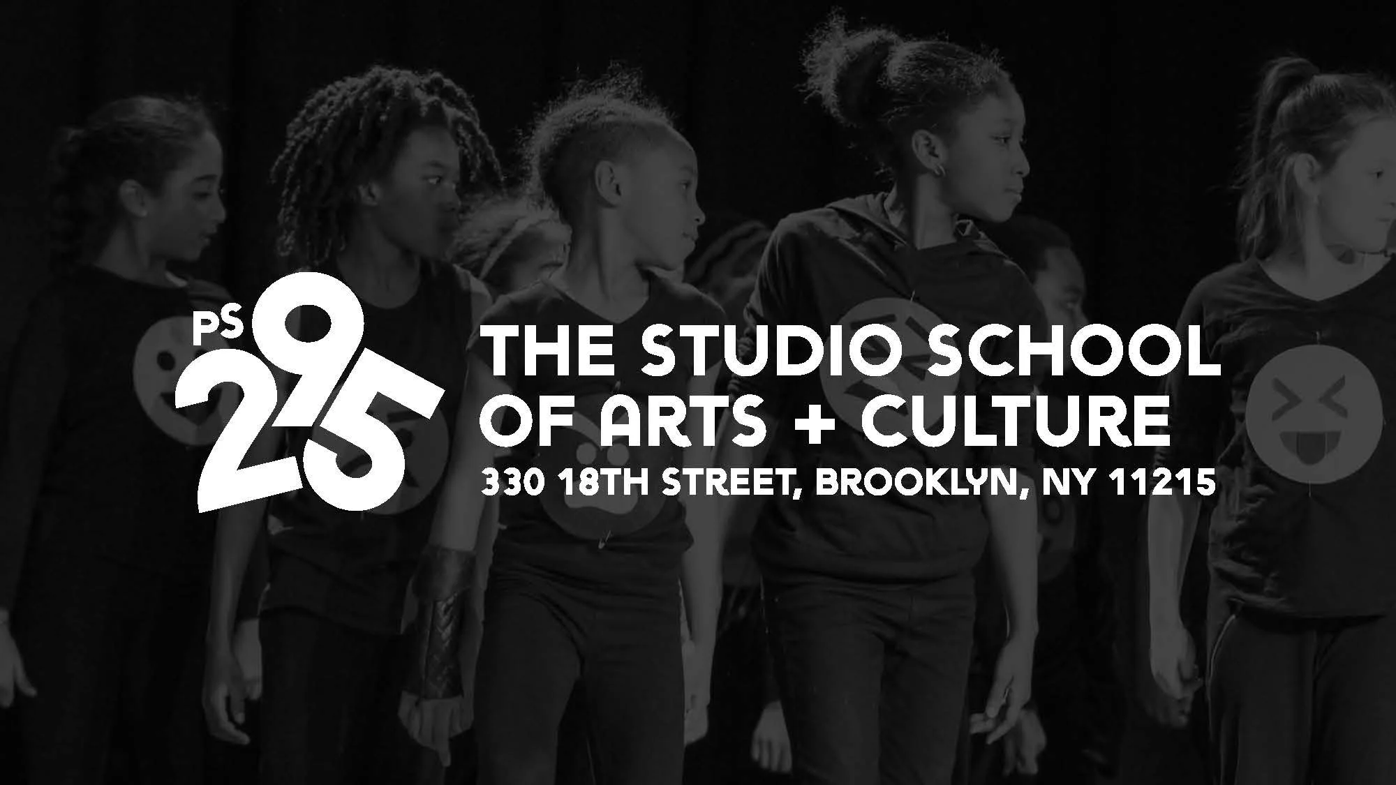
One color with school address included
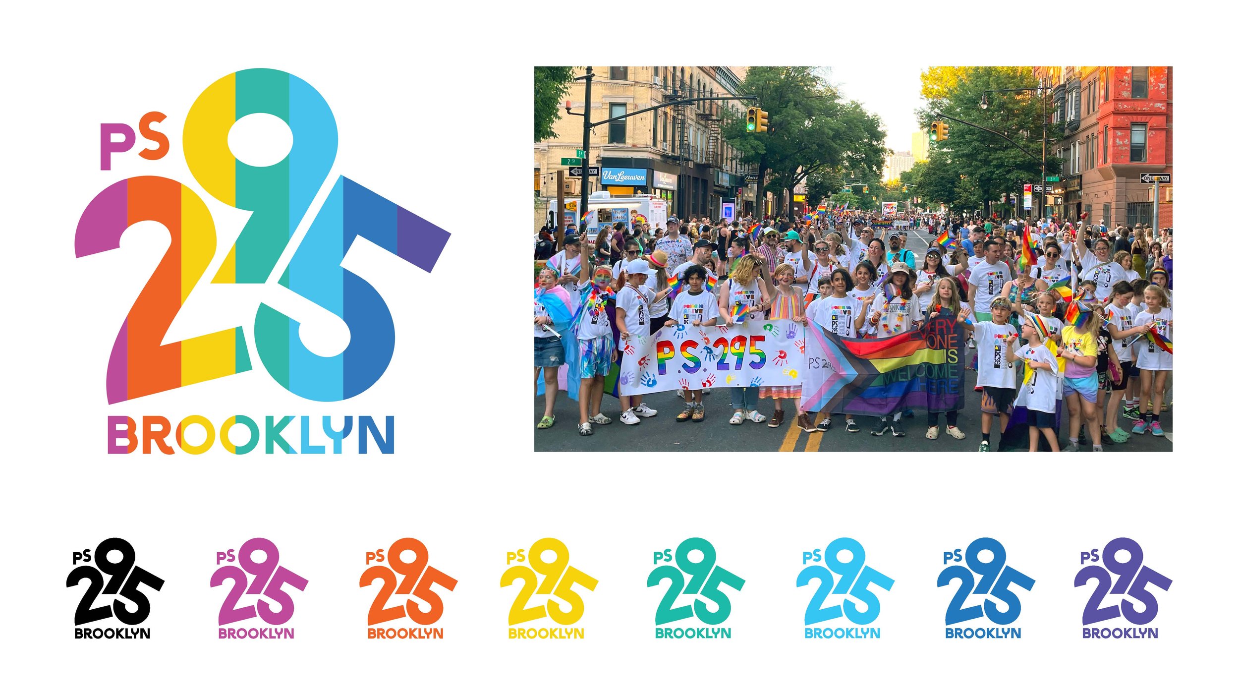
Pride is alive at PS 295 in brand colors
Duotone format in brand colors
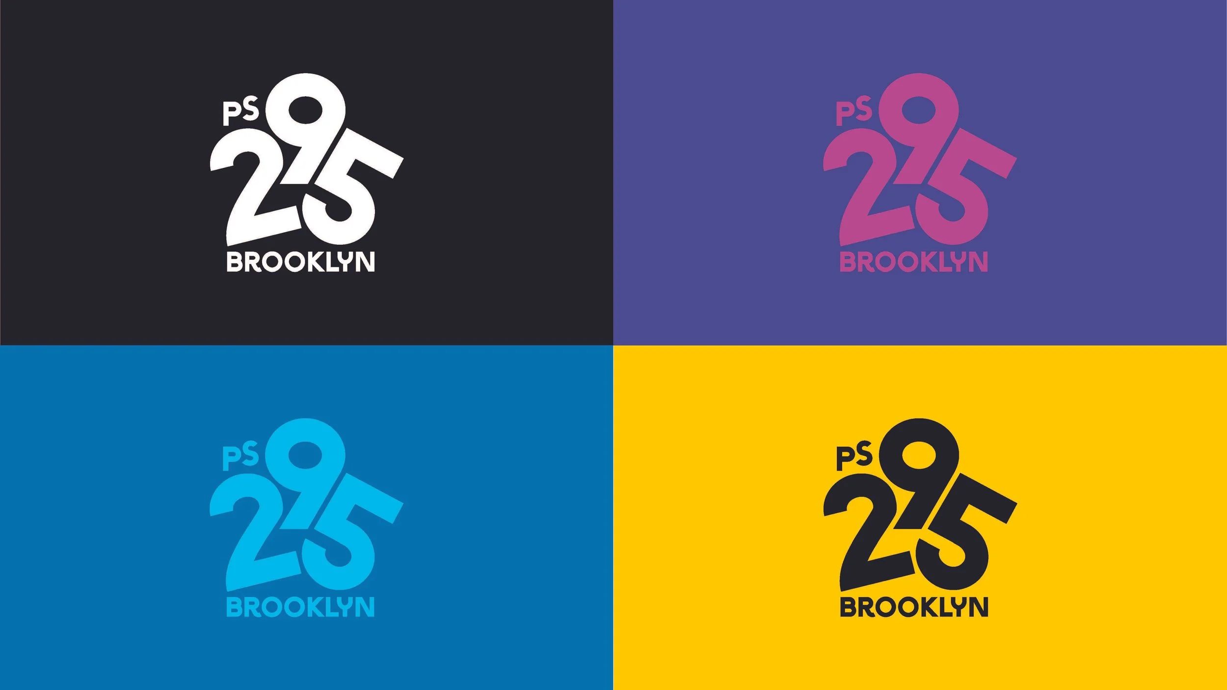
Using our Logo
We are very proud of our logo. Follow these guidelines to ensure it always looks its best. Our primary logo is the combination of our icon (the PS 295) and the wordmark, which includes multiple versions with the short and long names of our school:
PS 295 Brooklyn
PS 295: The Studio School of Arts and Culture Brooklyn
Our icon is a shorter version of our logo. Use the icon on its own only if you do not have enough room for the full logo or in cases when the PS 295 brand has already been established. While the icon can exist without the wordmark, the wordmark should never exist without the icon.
Our logo features a variety of layouts and formats to suit a wide range of evolving needs. Even with that flexibility, it’s important to maintain a consistent usage wherever it appears, especially in recurring applications, such as banners, social posts, merchandise, and flyers.
In most cases, prefer using the “stacked” version of the logo, with the icon above the wordmark.
Stacked (left) and Horizontal (right) formats
Circular Emblem formats
Logo Do’s and Don’ts
It's important that the appearance of the logo remains consistent. The logo should not be misinterpreted, modified, or added to. Its orientation, color, and composition should remain as indicated in this document — there are no exceptions.
Our logo should always be legible and impactful. Always apply a healthy amount of visual padding around the logo and the icon to isolate the brand from competing visual elements such as a busy area of an image, low contrast areas where legibility is compromised, or on top of text or supporting graphics. Simple is best.
Keep in mind the surrounding colors and select a logo that best works against that approved brand color. When possible, use the full color logo. The black logo should be used on light colored backgrounds. The white logo should be used on dark colored backgrounds.
Color
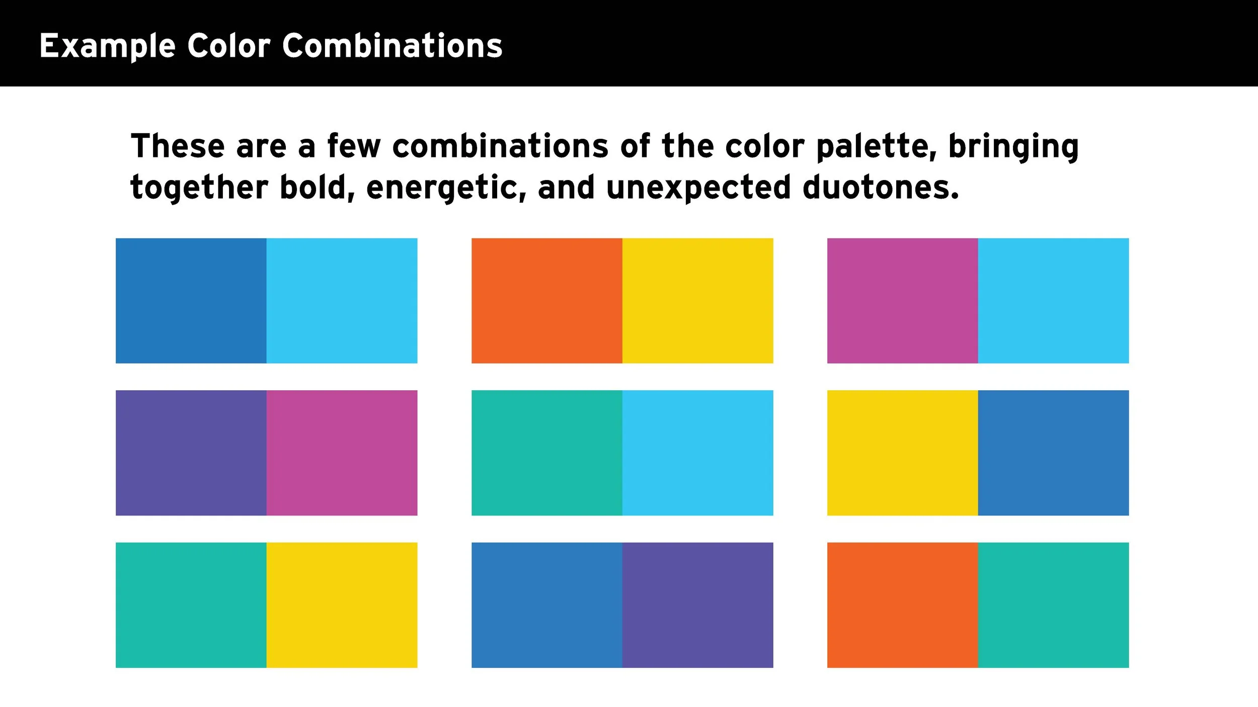
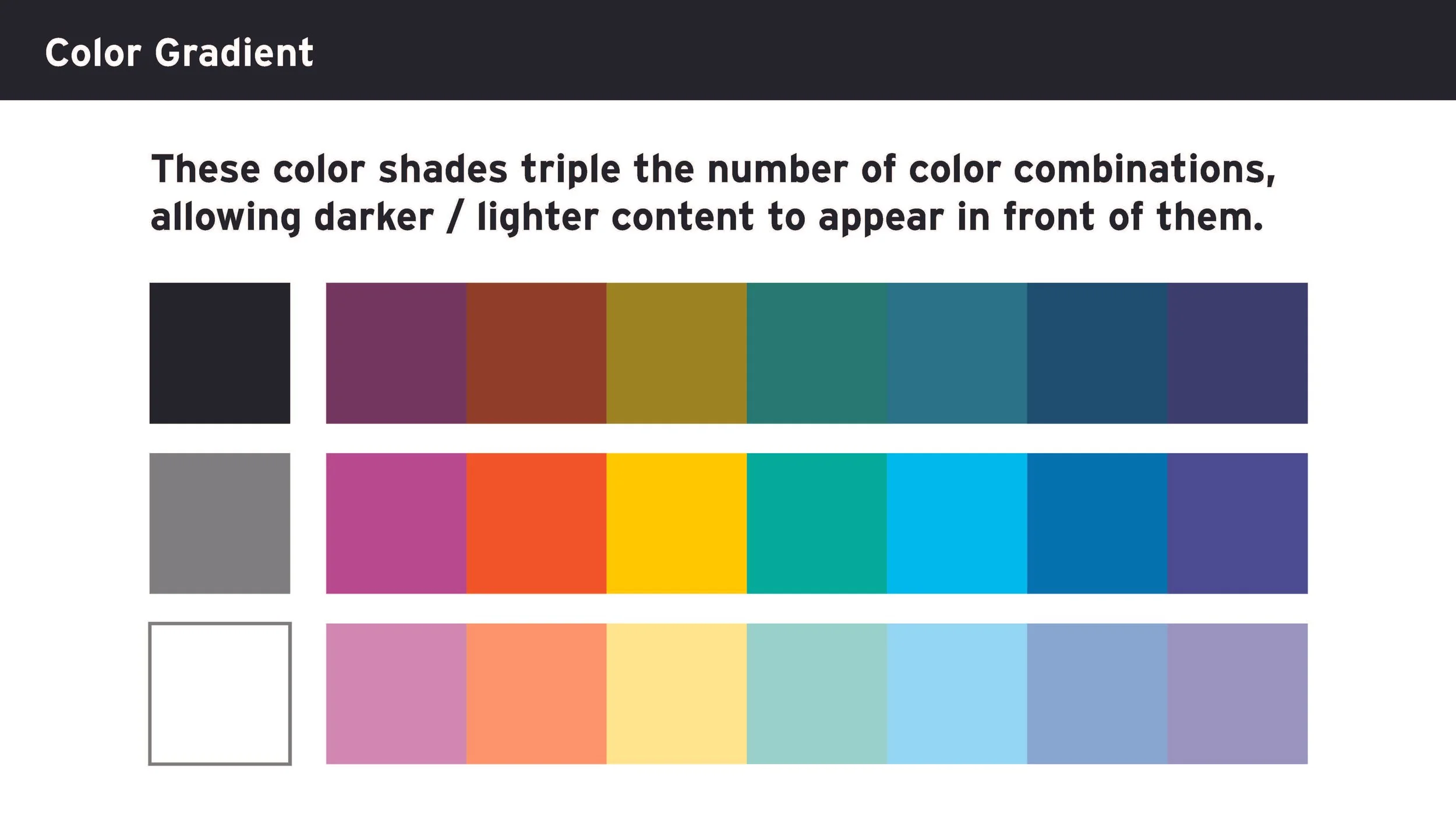
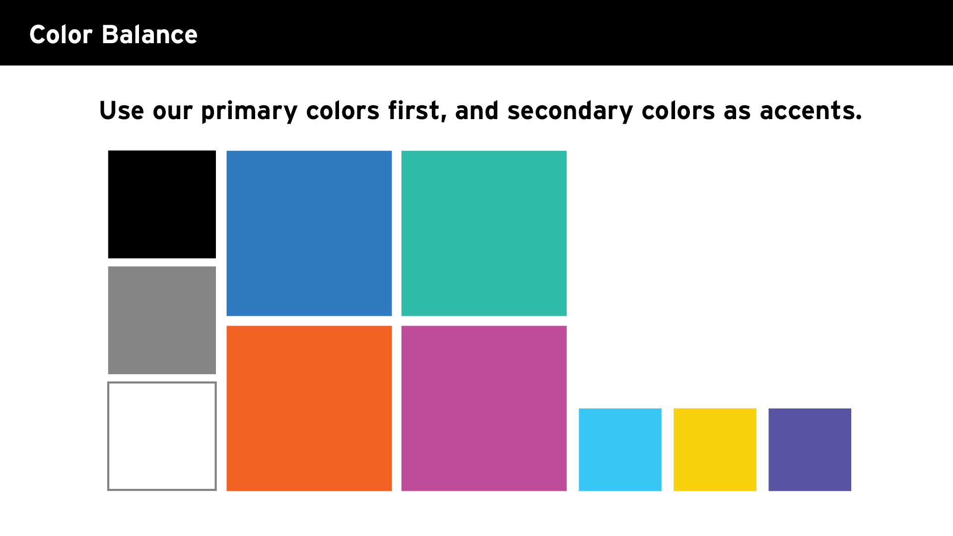
Our Color System
Our color palette provides distinctiveness and differentiation through the consistent use of PS 295’s most iconic and recognizable colors:
Harbor Blue
Brownstone Orange
Greenwood Forest
Pink Dreams
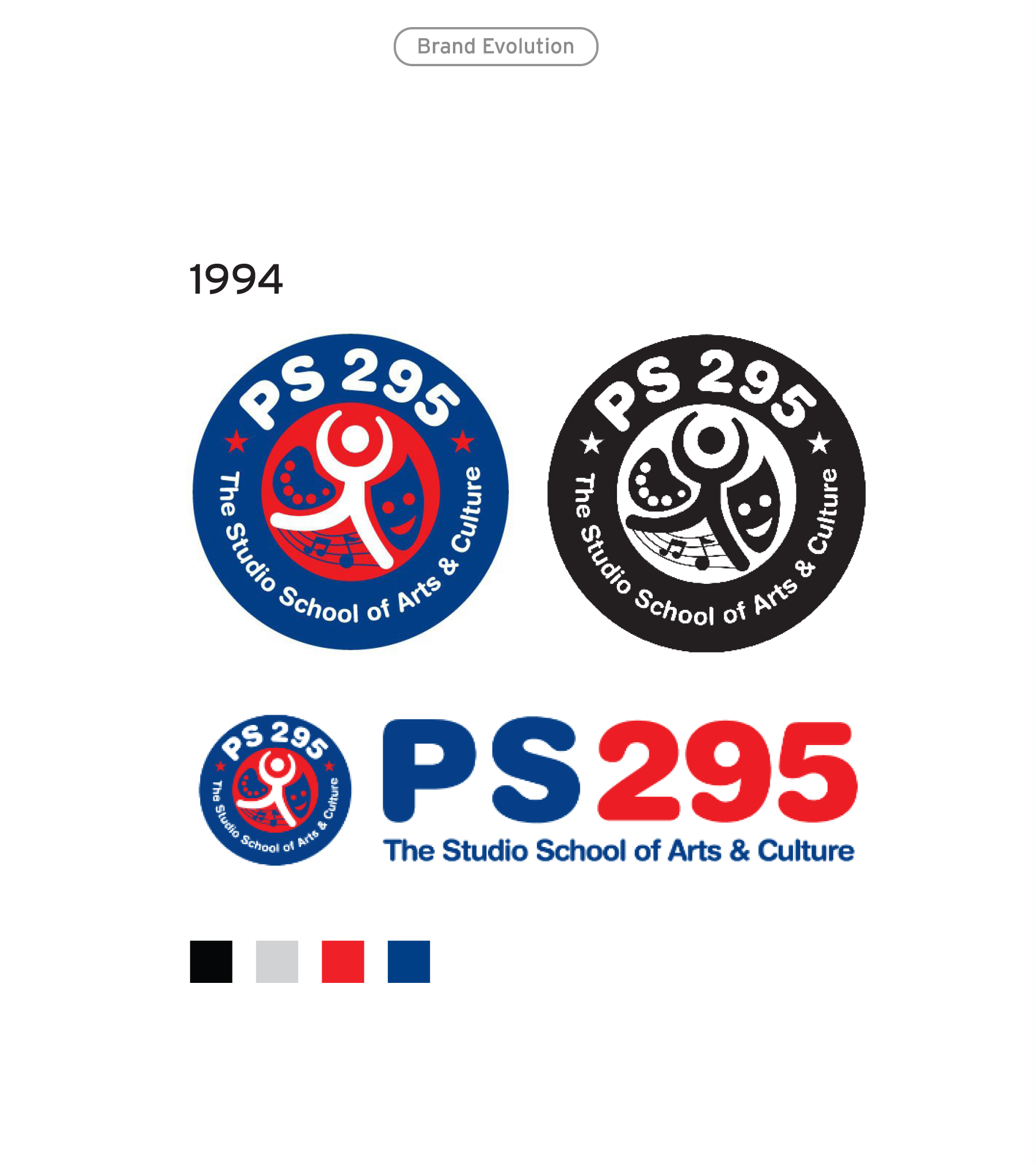
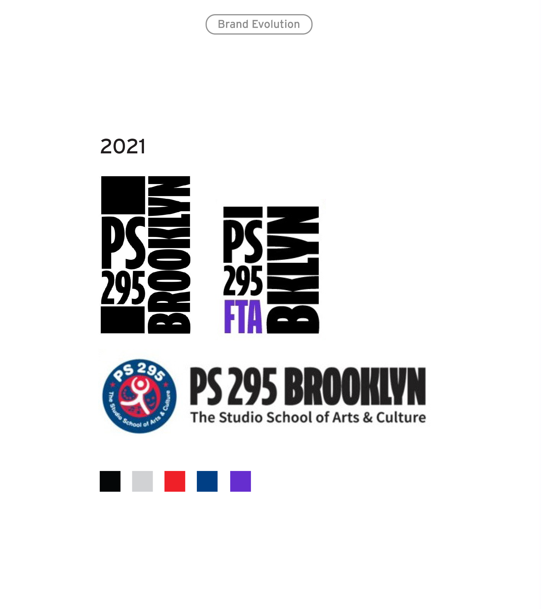
In previous iterations of the PS 295 brand identity, black, white, red, and blue were dominant colors.
This new palette introduces a warmer set of colors, inspired by world cultures and our vibrant neighborhood, that can be used in a wide range of combinations.
Meet the Palette
-

Harbor Blue
HTML #2e79be / CMYK 81 48 0 0
-

Brownstone Orange
HTML #f26322 / CMYK 0 76 99 0
-

Greenwood Forest
HTML #2dbba8 / CMYK 71 0 43 0
-

Pink Dreams
HTML #bf4a9b / CMYK 24 85 0 0
-

Sky's The Limit
HTML #38c6f4 / CMYK 62 0 0 0
-

Golden Hour
HTML #f7d20a / CMYK 4 14 100 0
-

Courageous Ink
HTML #000000 / CMYK 75 68 67 90
-

Purple Connection
HTML #5852a3 / CMYK 77 78 0 0
Type
Our Font System
Utilitarian yet beautiful with a few unique quirks, our primary fonts are designed to carefully balance expression with function and is used in all brand expressions.
Print fonts:
Web fonts:
By comparison, NYC Department of Education’s Style Guide uses Helvetica Neue across all materials. PS 295’s font system provides a visually distinct look from DOE content.
This new system presents a primary header font and body copy font, plus a supporting san serif font, that can work seamlessly together in any combination alongside the logo for any application, formal or informal. Most of these accessible fonts are available in platforms including Adobe Creative Cloud, Google Fonts, and Squarespace.
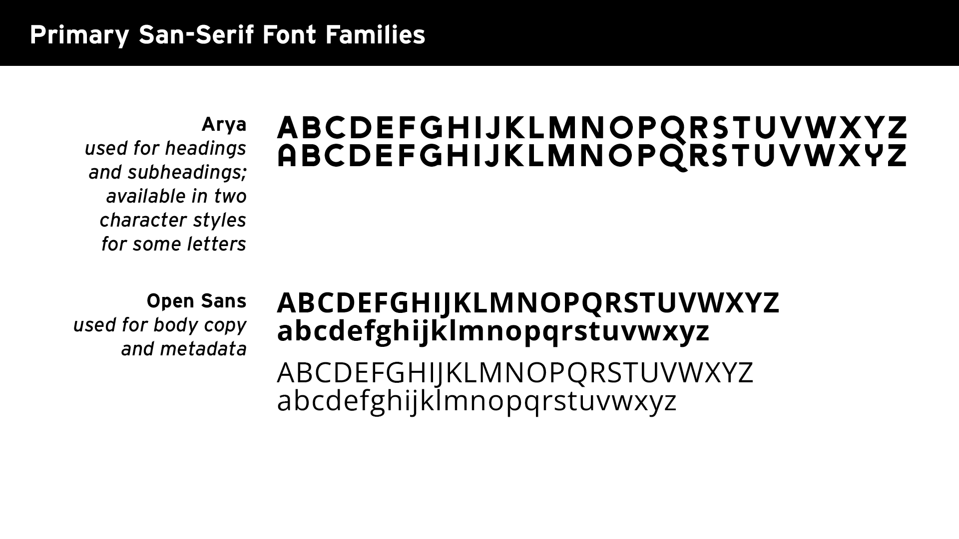
Primary font families
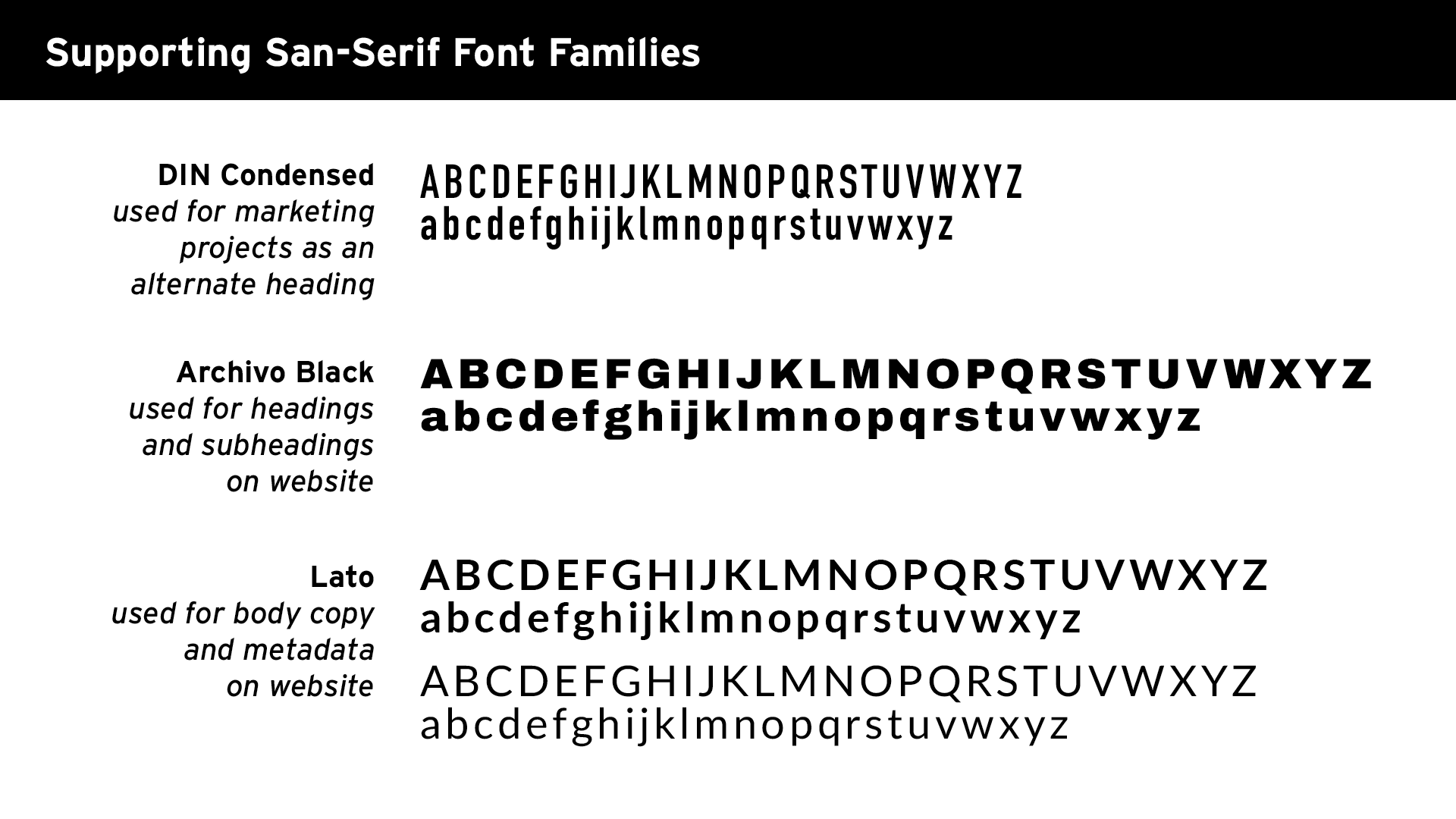
Supporting font families
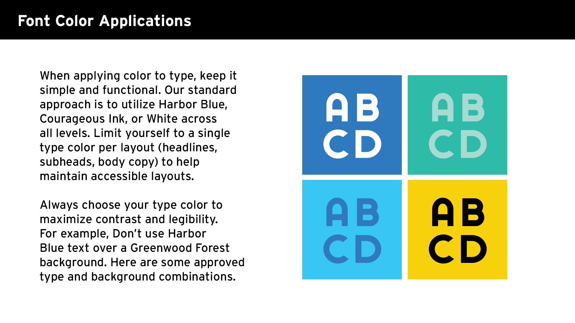
Font color applications
Icons
Our New Iconography
Historically, icons were created independently across teams, projects, and events, leading to a patchwork of styles and visual languages. Built as a global toolkit, PS 295’s icons now follow a single standardized approach – flexible enough to work across every cohort and sub-brand, but unified enough to feel unmistakably our school.
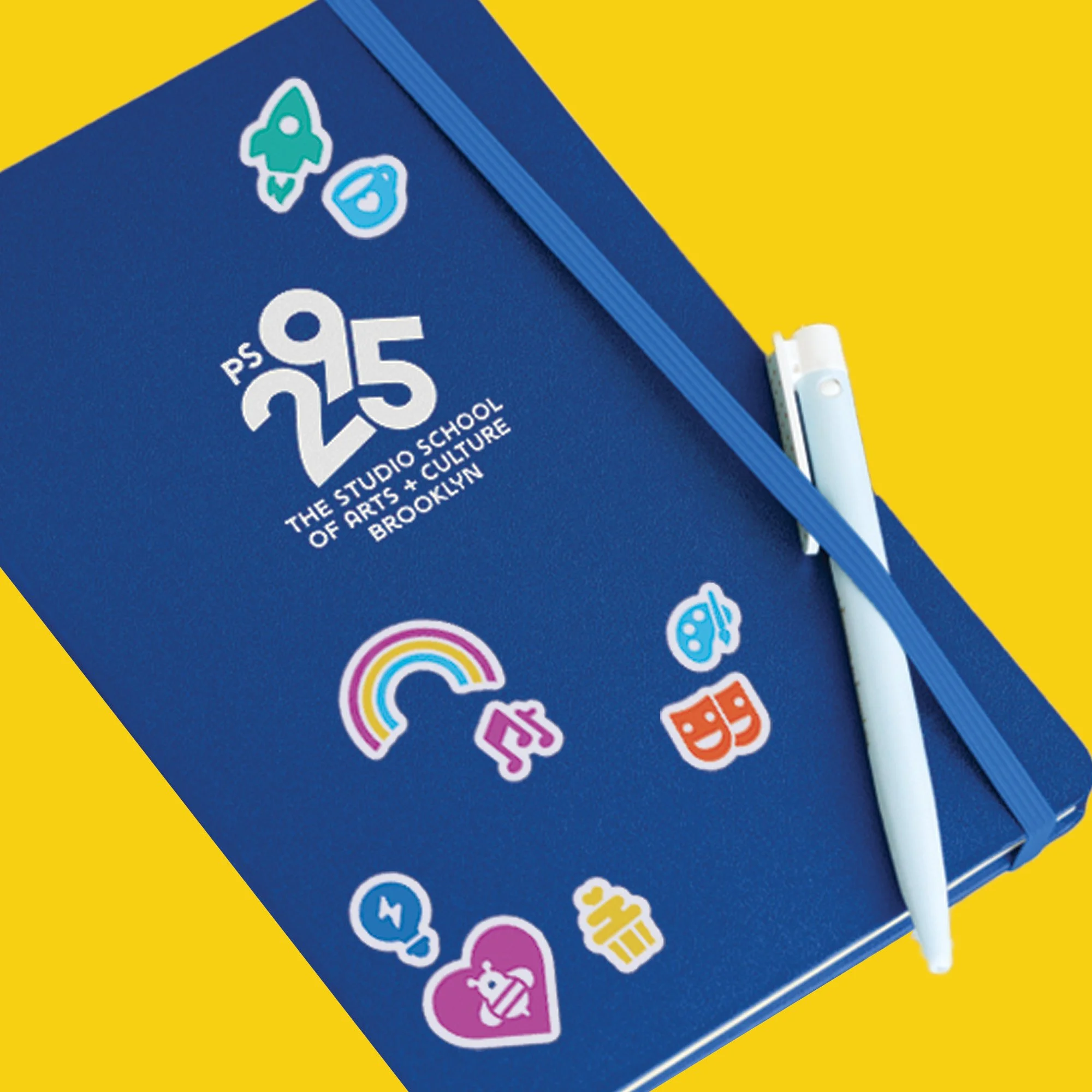
A minimalist bumblebee icon intentionally will appear in select touchpoints across the brand, bringing a unified design to the school mascot for the first time in 30 years.
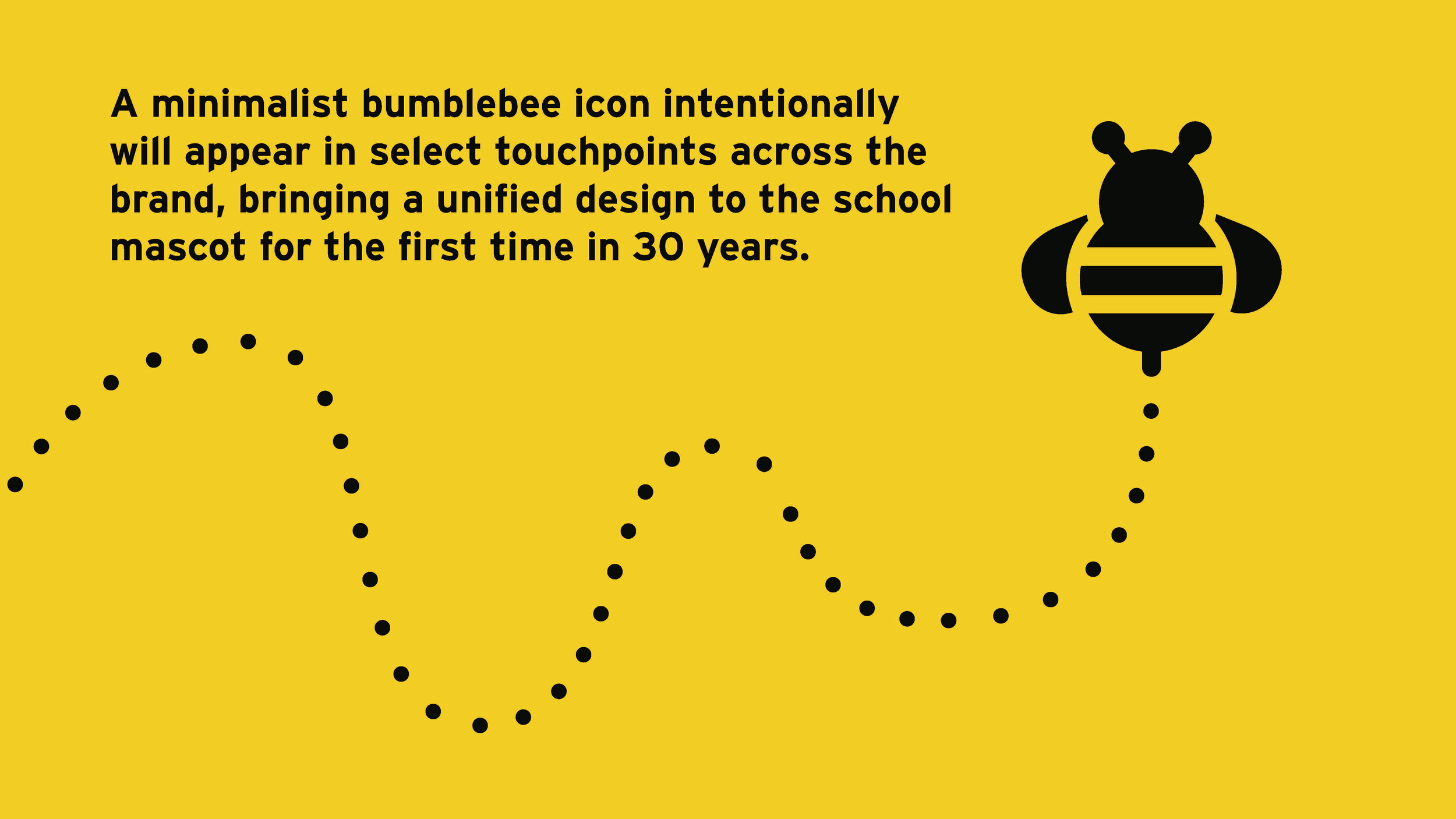
Yellow background with black text explaining Bumblebee icon design. Black dotted line illustrating wave pattern and a black stylized bumblebee icon with horizontal stripes and antennae.
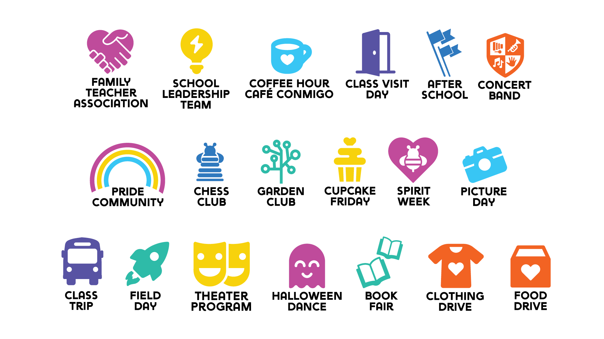
A colorful graphic with icons and labels for various school events and activities, including family teacher association, school leadership team, coffee hour, class visit day, after school concert band, pride community, chess club, garden club, cupcake Friday, spirit week, picture day, class trip, field day, theater program, Halloween dance, book fair, clothing drive, and food drive.
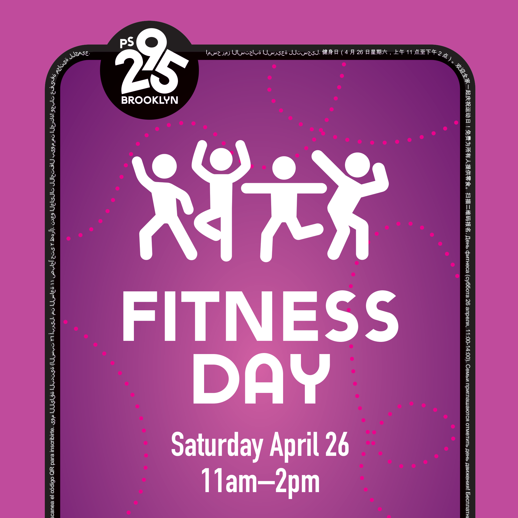
Flyer for Fitness Day on Saturday, April 26, from 11am to 2pm. Features stylized white line drawings of four people dancing and celebrating on a purple background with pink dotted lines and text.
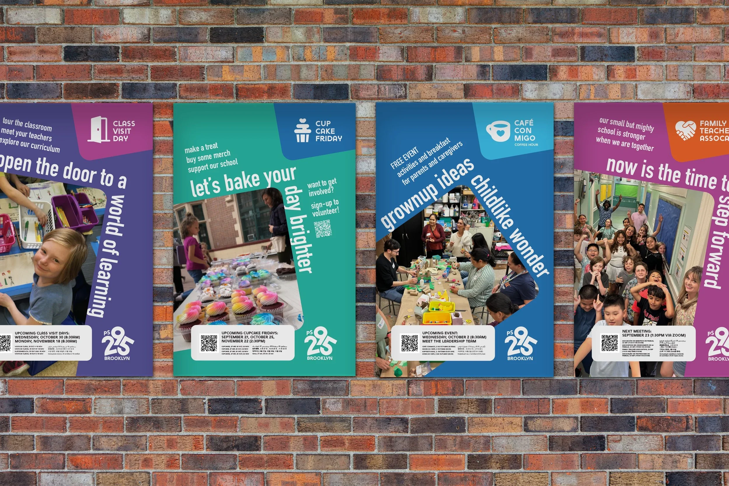
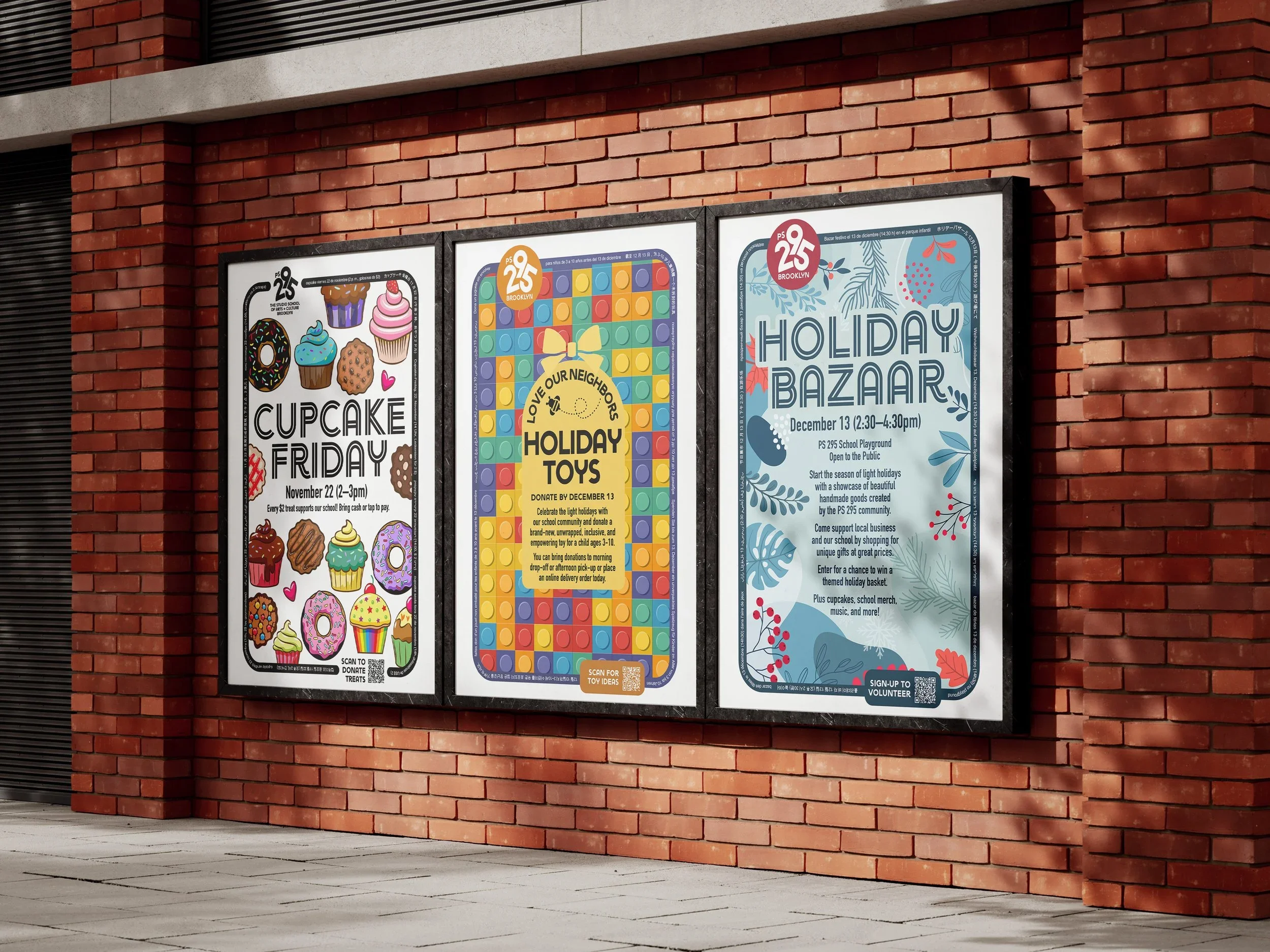
A series of four colorful posters on a brick wall advertising activities at PS 25 Brooklyn, including class visit day, cupcake Friday, grownup ideas, and a school open house, each featuring photos of children and events.

A repeating pattern of colorful icons on a black background, including cameras, purple hearts, yellow bees, blue light bulbs, orange paint palettes, purple theatrical masks, purple musical notes, a calendar page with the number 25, and green open books.
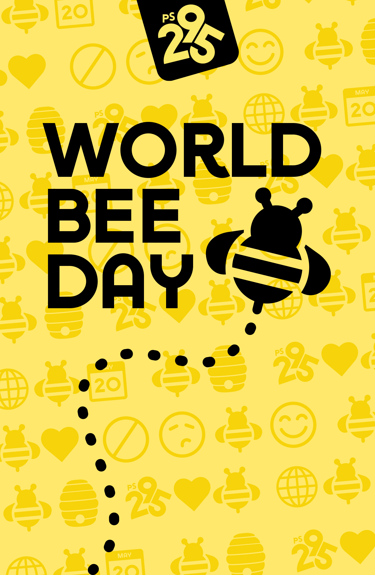
Celebrating World Bee Day with a yellow background filled with bee, heart, globe, and calendar icons. The overlay features bold black text that says 'World Bee Day' and a stylized bee graphic.
Layout
Build Elements Together
We use a grid system to assemble our brand elements into a whole. Whether we’re making a detailed multi-page presentation or a simple email, we always use the grid as our starting point.
After establishing a grid, our variety of logo and wordmark options allow for more design flexibility. With each template, we use a consistent type layout to enhance brand recognition and clarity, including accessibility for multiple languages.
-
When designing a layout, our first step is to establish margins using the formula:
Long Side ÷ 24 = Margin
In the case of very wide or very tall layouts, margins may need to be slightly reduced for optical correctness.
-
After setting our margins, we divide the page into columns and gutters to organize our content.
Columns are drawn in increments of 2, up to a maximum of 12 columns for our widest and most complex layouts. The width of our gutters may range from 50% to 100% of our margin, depending on your application.
-
Our preferred headline placement is in the upper left corner. Headlines should be large and impactful, but they should never occupy the full width of an application—we aim to keep the last column free from text to reserve space for our logo.
Short line lengths help keep our headlines large and impactful.
Longer line lengths may be used on wide horizontal layouts.
Leave columns free from text to reserve space for our logo.
-
Subheads may be no larger than 50% of our headlineʼs cap height to ensure proper hierarchy.
We always encourage larger size differentiation for maximum contrast between levels of text.
We prefer to stack our subheads left-aligned beneath our headline.
In extra wide layouts, the subhead may rest along the bottom margin.
Minimum space between headline and subhead is 3/4 of the headline’s height.
-
Our preferred logo placements are in the upper left corner and lower right corner. This keeps all text (including our wordmark) left-aligned in a clean block for maximum clarity and simplicity.
The height of our wordmark is roughly equal to our margin. Where possible, all text (including our wordmark) should be left-aligned.
-
This is a standard approach for our print flyers. When adding frames to a layout, our text and logos shift to accommodate this extra content. Our standard rules for sizing and placement still apply, but confined to a smaller page area.
Leave clear space equal to our margin between frames and other content.
Logos may shift away from document edge to make space for frames.
Headlines and subheads scale as a unit to maintain their size relationship.
-
When using full-bleed imagery, headlines and subheads may be moved around our grid to best fit the available negative space. Exact placement is flexible, just be sure all text is left-aligned to a column. Size and placement rules for our logos do not change.
Text should be placed over a natural clear space in the image.
Text may be left-aligned to any column while leaving room for our logo.
Our preferred headline placement is still the upper left corner, if possible.
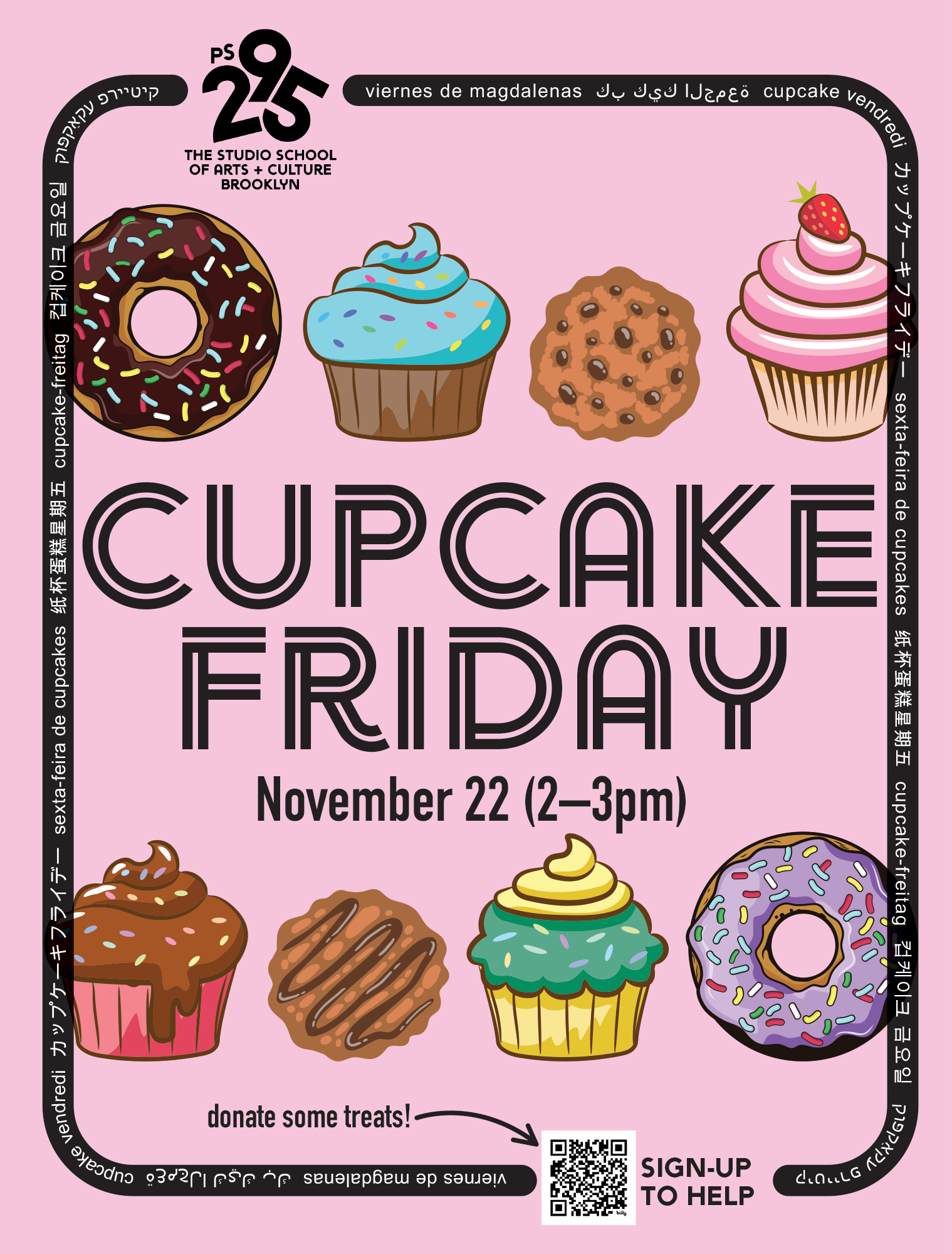
Pink flyer advertising Cupcake Friday event with illustrated cupcakes and event details.
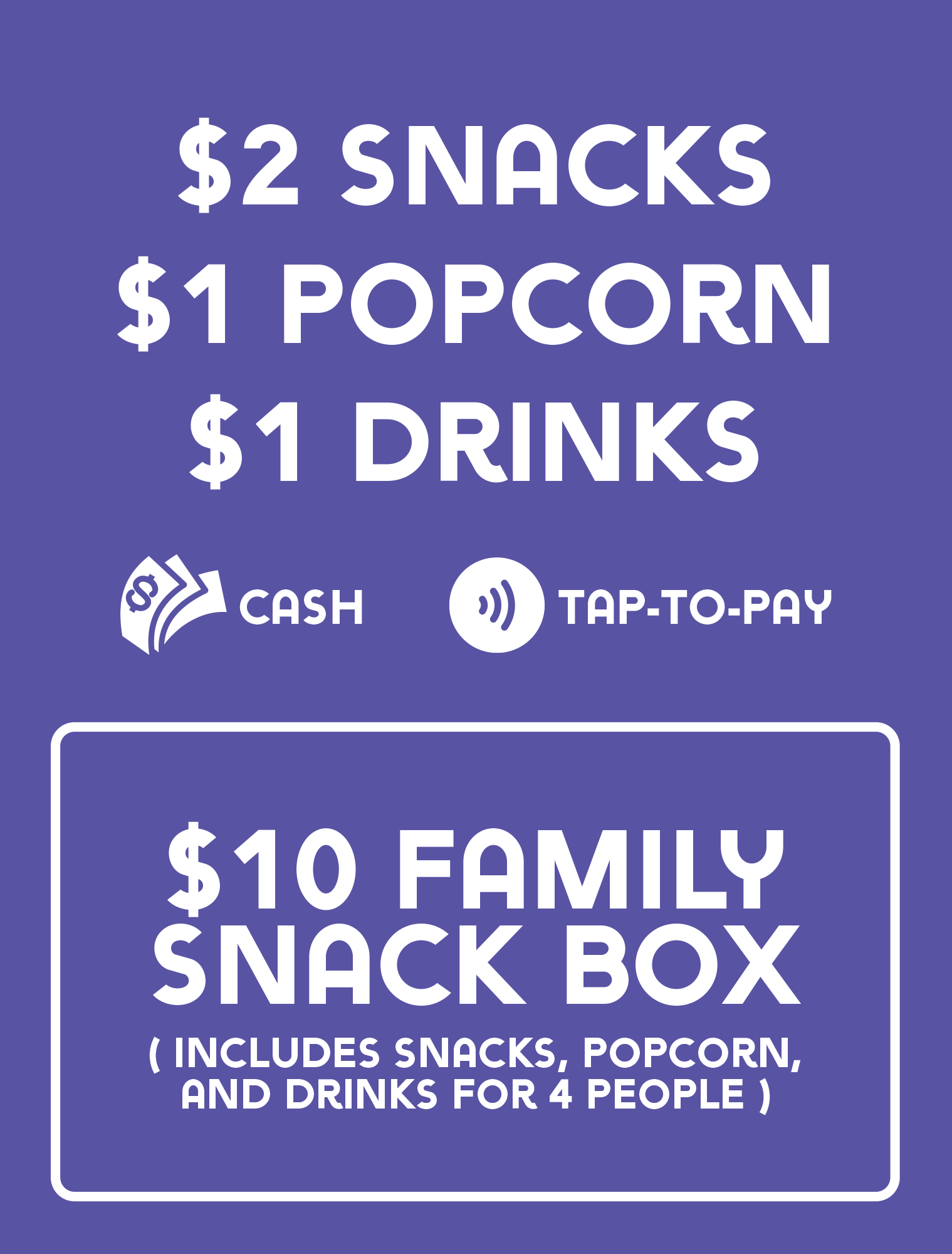
Signboard with prices for snacks, popcorn, and drinks, and options for cash or tap-to-pay. Special offer for a family snack box.
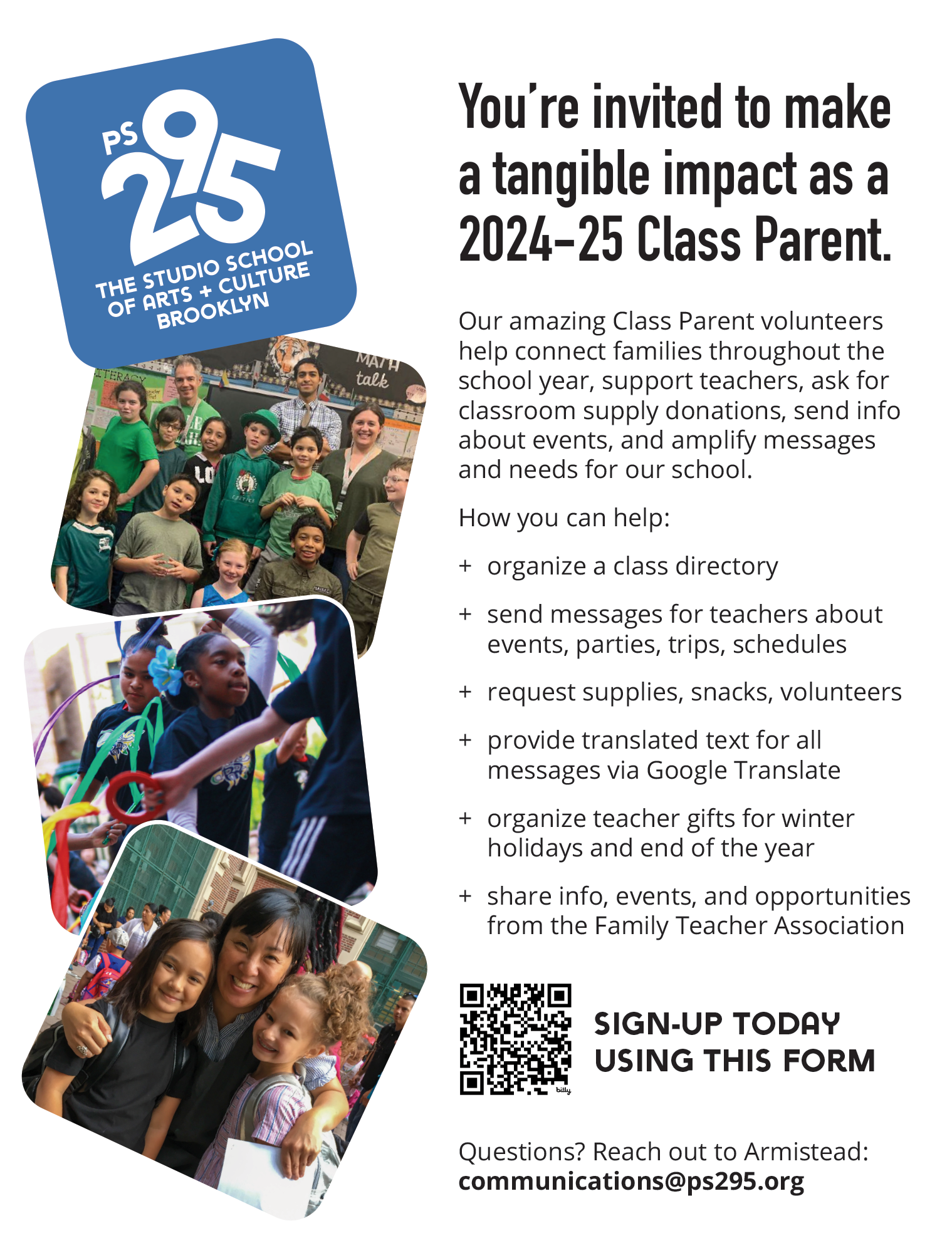
Flyer inviting parents to become class parents at PS 295 The Studio School of Arts and Culture Brooklyn, with photos of children, teachers, and parents.
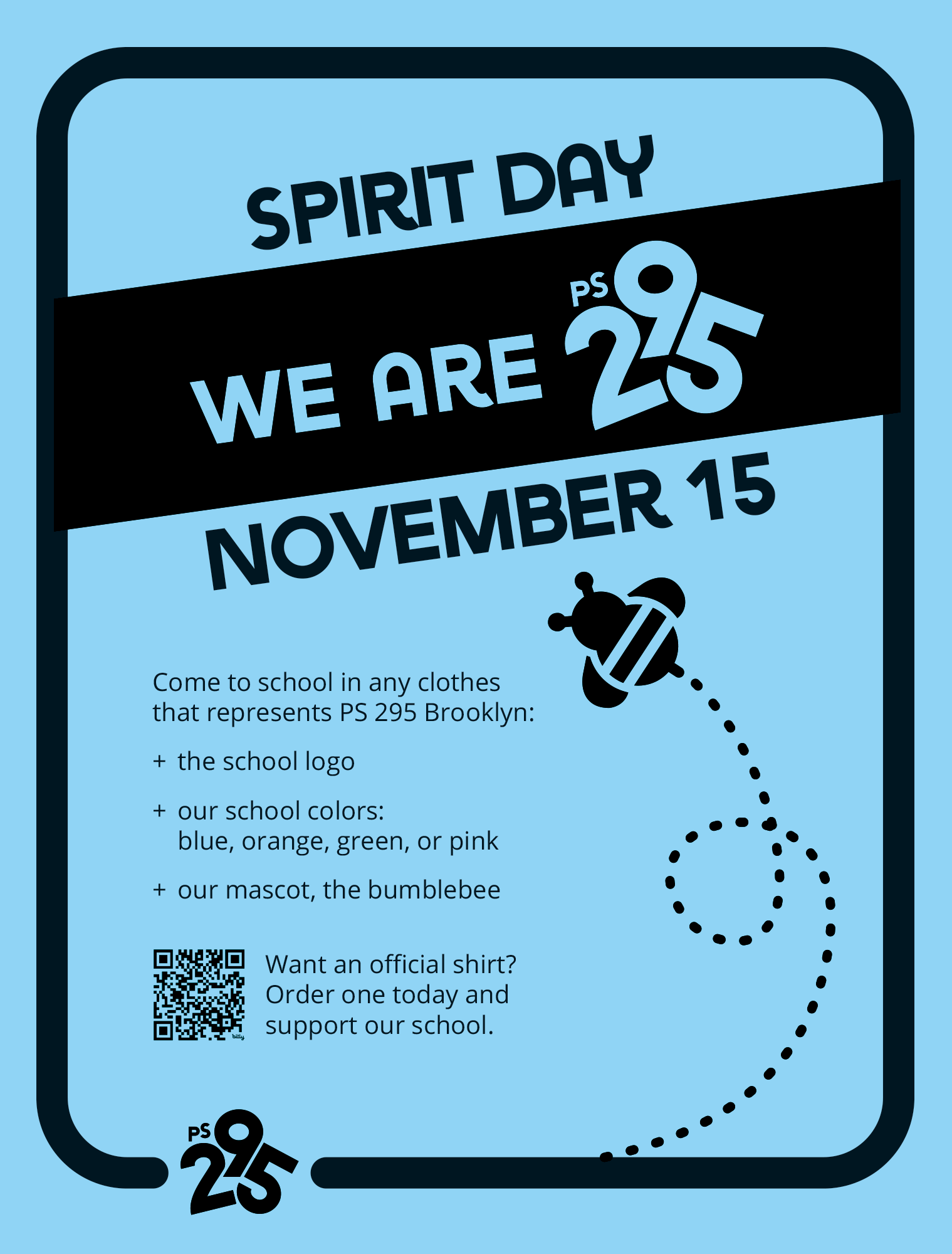
Flyer for Spirit Day at PS 295 Brooklyn on November 15, featuring a blue background, black and blue text, a dashed line with a looping motion, a cartoon bee mascot, and a QR code for ordering official shirts.
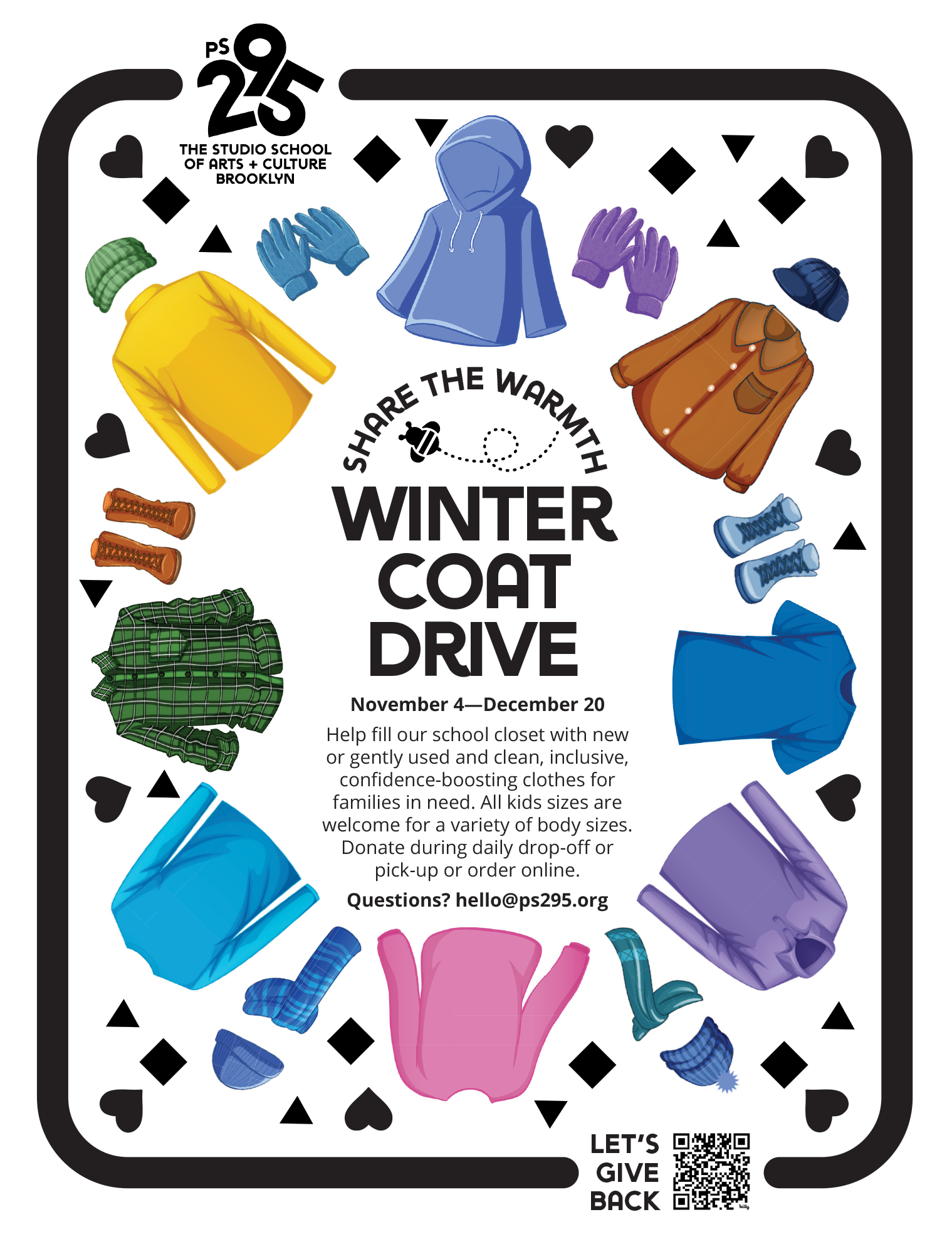
Flyer for winter coat drive at The Studio School of Arts + Culture Brooklyn, running from November 4 to December 20. The flyer features illustrations of various winter clothing items, such as jackets, gloves, hats, and boots, arranged around the text. It encourages donations of new or gently used, clean, inclusive, confidence-boosting clothes for families in need, with options for drop-off, pick-up, or online order.
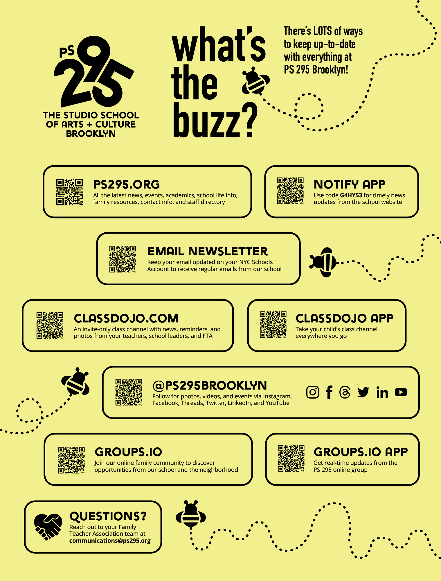
Informational poster for PS 295 Brooklyn from the Studio School of Arts and Culture Brooklyn, displaying contact info, websites, social media, and QR codes for updates, newsletters, apps, and groups, with bee and baby bug illustrations.
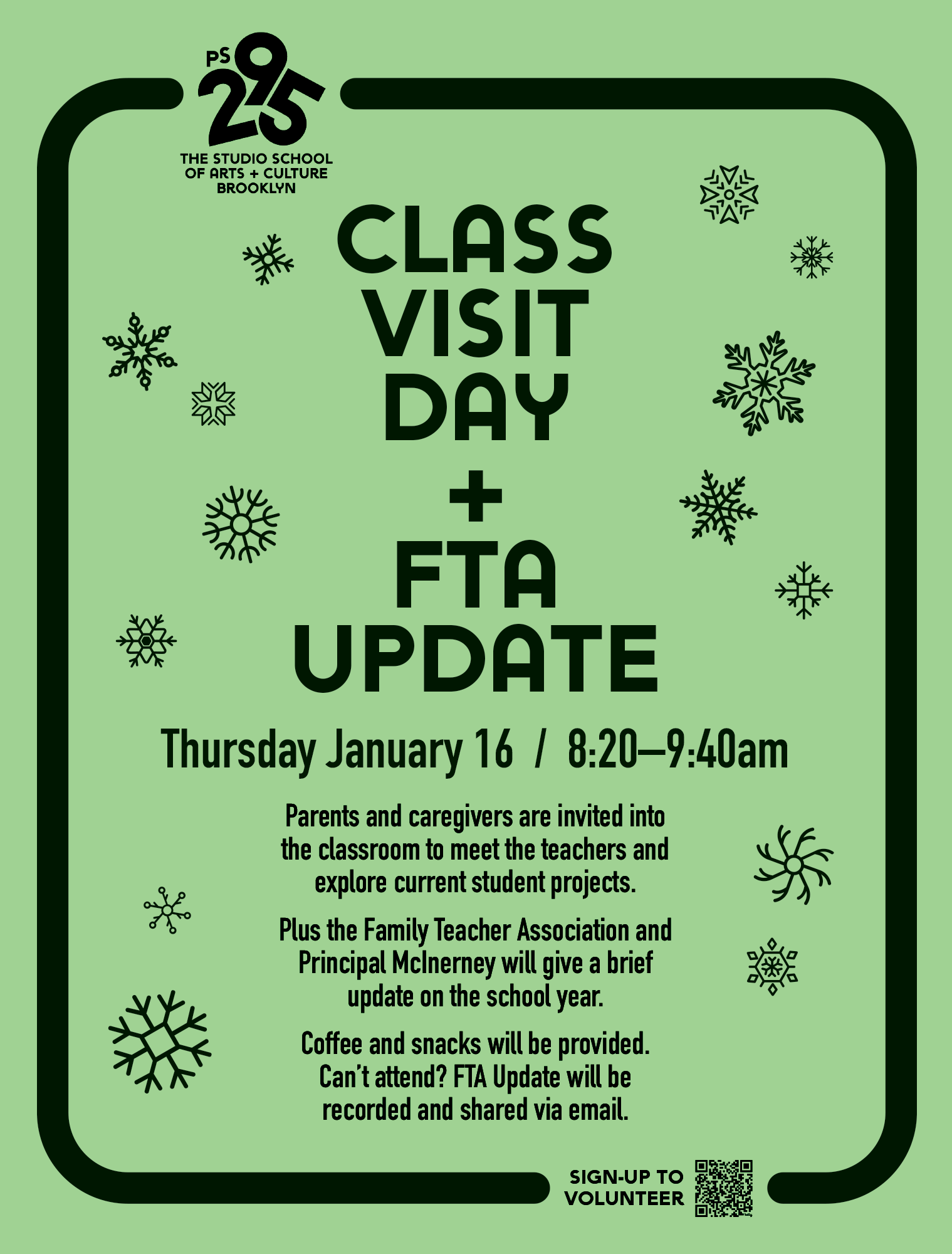
Green poster announcing Class Visit Day and FTA update at The Studio School of Arts + Culture Brooklyn, scheduled for Thursday, January 16, from 8:20 to 9:40 am. Includes snowflake decorations, event details, and a QR code for volunteering sign-up.
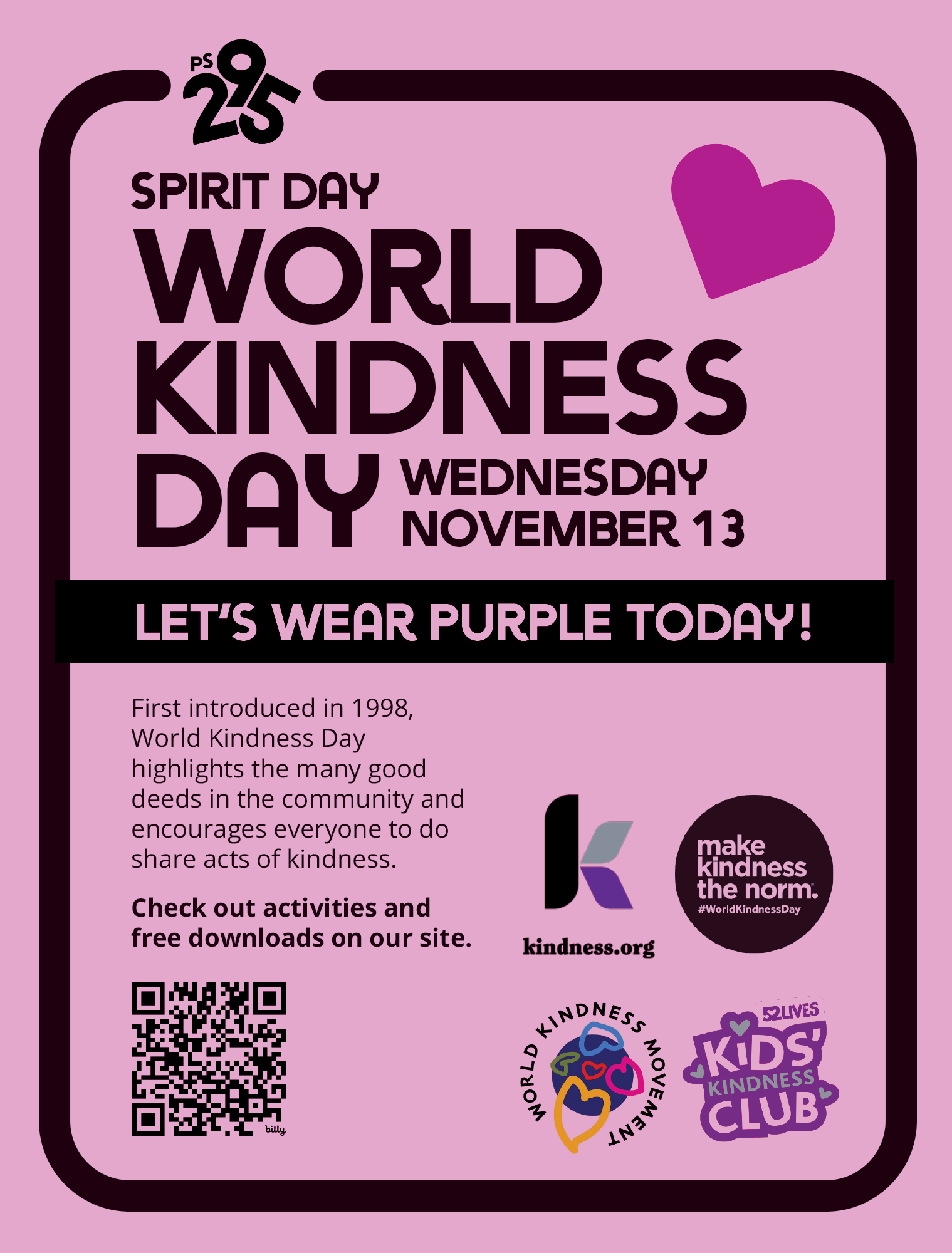
A pink poster celebrating World Kindness Day on November 13, encouraging people to wear purple and perform acts of kindness. It features a purple heart, QR code, and logos for kindness.org, World Kindness Movement, and Kids Kindness Club.
Voice
Let’s be our authentic selves
At PS 295, it’s important that we speak with a consistent, unified voice. Our best practices and guidance help maintain our verbal style so we always sound genuine, warm, clear, and trustworthy to our school community. Together we are:
Conversational
Confident
Captivating
Our voice principles inform how we speak with our families, neighbors, staff, and local leaders, from the content on their social feeds to their experience on the school campus. These principles are a direct translation of our core brand, specifically tailored for verbal and written expression.
-
Do aim for the easy read. Use simple word choices, clear sentence structures, and well-known turns of phrase.
Don’t complicate things with education jargon, uncommon phrasing or complex words. When in doubt, ask yourself: would you say this in an everyday conversation?
-
Do be specific and direct. Showing expertise when discussing projects or events helps your copy connect with our community, informing everyone regardless of how informed they are. Tie everyday complications and quick solves to product use cases.
Don’t be vague. Vagueness clouds the intent of your copy and will feel passive, bland, and boring. Think if anyone will have questions that need to be answered.
-
Do use punchy sentence structures. You can even use wordplay and subtle rhymes. Have fun with your writing and make it engaging and vibrant.
Don’t tell jokes. Our humor and fun come from a place of relatability, centering on all of our diverse families and their myriad experiences so we never become cheesy or contrived.
Questions? Need downloads or templates? Contact us. We’re happy to help.